


Hi, Rockits!
hirockits.ruWebsite, branding, identity
Hi, Rockits! — IT recruiting agency that has been finding talents for 14 years.
About the project
The company invited us to help completely reload the brand image, move away from the previous naming and update the positioning in the IT recruitment market. To do this, it was necessary to develop a new platform and visual style that speaks the same language with both the potential customer and the applicant.
Through immersion in internal culture and qualitative research, we have come to the conclusion that the character of the company is determined by the people who work in it.
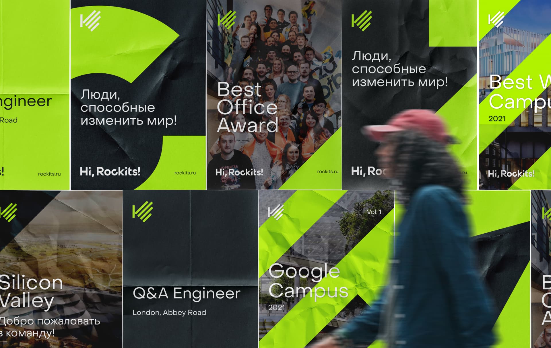
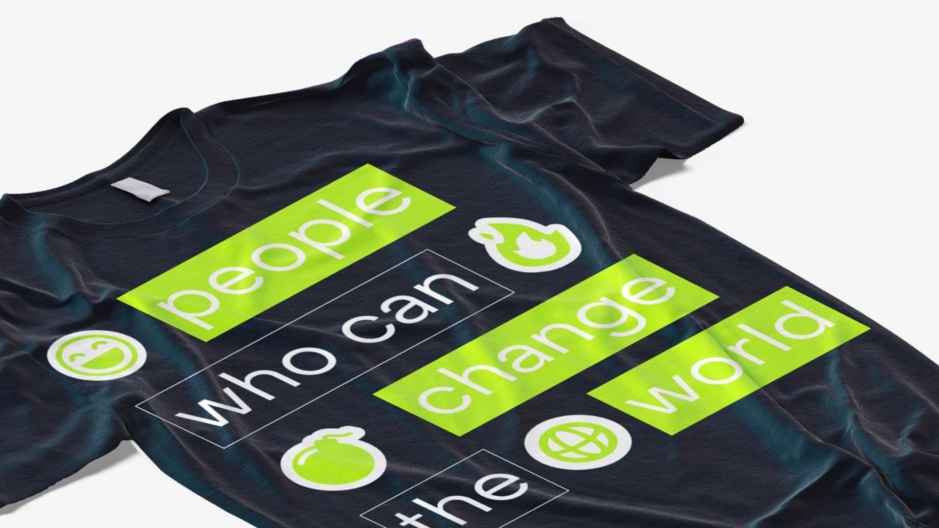
Guys from Hi, Rockits! always on a drive, positively disposed and charged for the result. This attitude to work has become the main idea of the brand.We tried to convey the energy emitted by people within the company in the identity through a color that we called "Energy Rockits"."Hi, Rockits!" Is a complex but emotional name. “Hi” immediately introduces the brand through an emotional and open welcome, while “Rockits” conveys the dynamics of the agency's team and their focus on results.
Логотип
The manifestation of this very trait of Energy Rockits is also transmitted in logomotion. The logo paired with a waving hand sets the dynamics of the movement. The bevels of the letters and palms are directed upwards on a diagonal. They demonstrate a simple and straightforward metaphor for the growth and continuous development of a company, which is an integral part of the IT industry.

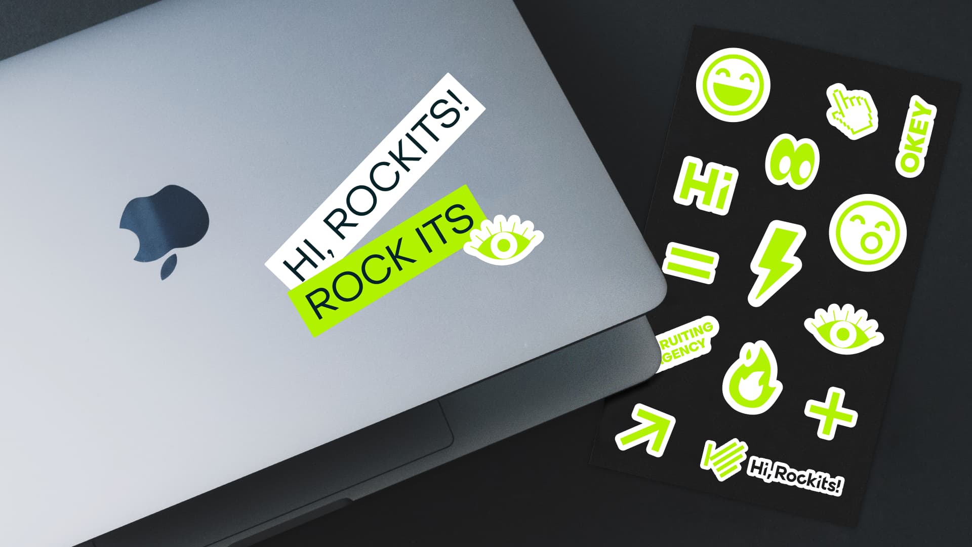
The new color ideologically laid down on the brand carriers, showing the inner strength and determination of the team.A friendly and welcoming palm has become the basis of the bold and daring lines of the pattern and brand element that emphasize the design of the layouts and allow the brand to be identified paired with the Energy Rockits color.
The accent pattern can be broken down into separate elements, which continues the development of a new corporate identity.
For the digital environment, we have prepared basic elements so that they are easily scalable, flexible, and at the same time, with the help of simple graphic combinations, make the brand image recognizable.
For the digital environment, we have prepared basic elements so that they are easily scalable, flexible, and at the same time, with the help of simple graphic combinations, make the brand image recognizable.
The new branding came out with a pronounced emotional component. When he meets him, he conveys the friendly, open and honest attitude characteristic of the agency, creating the necessary connection between the client and the recruiting team.
More about Hi, Rockits!
The agency has been in IT recruiting for 14 years, formerly known as Star Staff. The company recruits specialists for medium and large enterprises, as well as startups. They close the competencies and the need for resources to find IT specialists, so that clients do not have to grow such expertise internally. But at the same time it was possible to close these positions as soon as possible.